HypeBrand system and motion-driven site for a creative agency
- UI/UX Design
- Branding & Motion
- Web Development
- India
- Live site
01 — The Challenge
Make the website the portfolio piece.
Hype came to us with a four-service identity and one hard requirement: the site had to be the argument, not a brochure describing one.
That turned three comfortable assumptions into engineering problems.
The first is that four colours are a palette. Hype's mark is a 2×2 grid in red, amber, green and blue — one per pillar, deliberately familiar. Measured as text on a warm paper ground, all four fail the WCAG floor: yellow at 1.8:1, green at 2.1:1, blue at 3.6:1, red at 3.65:1. Borrowing a palette borrows its problem.
The second is that motion is decoration. For an agency whose fourth pillar is software development, the animation layer is the only pillar that can be demonstrated on the page rather than claimed — which means it has to hold frame rate on a mid-range Android and disappear entirely for anyone who has asked their system for less motion.
The third is that consistency is a review step. A four-practice agency needs four colours that read as one family on sight, across every service page, section and call to action. Policing that by hand is a cost that recurs forever and never appears on an invoice.
02 — The Brand System
Four borrowed hues, and the contrast problem they bring.
We turned the pillar logic into a design-token system: every service page, section and call to action inherits its pillar colour programmatically, so none of the four pillar pages carries a hand-picked value.
The contrast failure is solved in the token layer rather than by a reviewer. Each pillar carries a second, darker value that exists only for type. Body copy, stat numerals and labels resolve to that one — amber clears at 4.7:1, red at 6.2:1, green and blue higher. The bright value is restricted to stripes, watermarks, rules and washes, where contrast rules do not apply. In dark mode the two swap, because the bright value is the readable one on a near-black ground.
Large display numerals get the vivid colour back without paying for it: a thin rim of the bright hue is stroked around a glyph filled with the dark one. The fill is what a contrast checker measures, so the ratio is unchanged and the signal colour returns at the edge.
Colour frames a page and never fills it — and the token layer, not a reviewer, is what enforces that.
03 — Motion
GSAP with the reduced-motion switch built in.
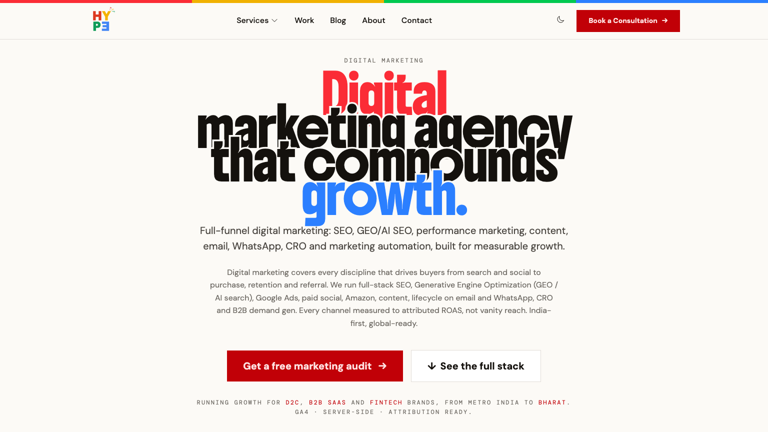
We built the animation layer on GSAP under a strict engineering discipline: transform-only properties for GPU compositing, orchestrated section reveals, and a global reduced-motion switch that zeroes animation for users who opt out — WCAG 2.1 AA conformance without a second-class experience.
The kinetic type on the homepage is the clearest statement of it. The motion isn't decoration; it is the demonstration of the software-development pillar.
04 — Share and Search
Every page arrives with its own artwork and its own keyword map.
A shared link carries the thing it is actually about. A blog post shares its own display image, a case study shares its own, an influencer profile shares the creator's avatar, and only the pages with no artwork of their own — the homepage, the index pages, the service pillars — fall back to the site card. That fallback URL is built from the site config rather than hardcoded, because a social preview has to be an absolute URL or the platform quietly drops it.
Each service page was then built against its own keyword-mapped SEO and conversion audit — structured metadata, semantic headings, and conversion paths designed per pillar rather than a single generic contact funnel. The same discipline reaches the machine readers: sitemaps and an llms.txt index are served from the content itself, so an AI assistant asked about the agency reads the agency rather than a directory listing.
05 — Snapshot
The Hype build: stack, scope, shipping model.
| Client | Hype |
| Segment | Creative agency — digital marketing, brand design, influencer marketing, software development |
| Scope | Nuxt development and brand system — motion-driven marketing site, per-pillar SEO and conversion architecture, AI-readable content endpoints |
| Service pillars | 4, each with its own signal colour and conversion path |
| Frontend | Nuxt and Vue, Tailwind CSS, GSAP, Pinia, Swiper |
| Social previews | Per-page og:image from each page's own artwork, with a site-config fallback |
| Backend | Laravel API with a Filament admin panel |
| Quality gates | 88 backend tests across 20 feature suites, including a query-budget test that fails when a page starts issuing more queries than it should; WCAG 2.1 AA contrast and reduced-motion support |
06 — FAQ
What buyers ask about a Nuxt brand platform.
Why build a custom site instead of using a template or page builder?
Because an agency website is the pitch, not a brochure. A template makes the craft argument impossible to win: the prospect has already seen that hero, that grid and those claims on three competitors' sites the same morning. For agencies specifically, the site has to be a work sample.
How do you keep a four-colour site accessible?
By splitting each hue in two at the token layer. The bright value is chrome — stripes, watermarks, washes, decorative letters — where contrast rules do not apply. A second, darker value is the only one type is allowed to use, and it clears WCAG AA on the warm paper ground. In dark mode the two swap. Because it is a token rather than a guideline, a new page cannot get it wrong.
Does the motion slow the site down, or shut people out?
Neither. The animation layer is transform-only so it composites on the GPU rather than forcing layout, which is what keeps it smooth on a mid-range Android. And a global switch reads the operating-system reduced-motion preference and zeroes the animation for anyone who has set it — not a degraded fallback, just the same site without the movement.
Where do the social preview images come from?
From the pages themselves. A blog post, a case study and an influencer profile each already have artwork worth showing, so that is what the share card uses; everything else falls back to one site card. The words beside the card come from og:title and og:description rather than being drawn into the image, which means editing a headline in the CMS changes the preview without regenerating anything.
Is every service page optimised the same way?
No, and that is the point. Each pillar page was built against its own keyword-mapped SEO and conversion audit, with metadata, semantic headings and a conversion path chosen for that service rather than a single generic contact funnel shared by all four.
What does a site like this cost, and how long does it take?
A marketing site with a real brand system behind it is a mid-size web application, not a template fill. The band is 8–12 weeks, and the brand work happens first — tokens, type scale and motion rules decided before any page is built, which is what stops the fifth page drifting from the first.
A site without a token system or generated share images is cheaper and faster. It also needs someone policing consistency by hand forever, and that cost does not appear on the invoice.